Evaluation point

Following on from my evaluation of what a strange places is and my late deeper evaluation of what was said in my survey I decided to evaluate my thinking about the ideas I was having during my making period.

So far I have been finding strange places and then trying to illustrate them directly. However the problem I’ve been having is like when Christoph Niemann talks about illustration when you show the real thing you kill it’. By trying to make some of my images hyper realistic it takes away the character. So towards the end of the experimentation period that I just had I’ve been having a lot of fun representing strange situations and ideas of being in a strange places. Sometimes not drawing actual places at all. While most of the image I’ve done hint at certain places they are largely uncanny and strange.

I think having this period of reflection was really helpful as I have been able too start looking at how my project may have evolved from what it set out to be and weather or not my current idea is fit for purpose.

Next I plan to go back though feedback I have been given in my crits to improve foundation of research, starting with looking at literature music and philosophy.

Thinking about what strange place actually is

Looking backwards on the period of experimentation I was quite happy with what I had achieved and the work I had produced, but before I started testing final idea concepts I decided to have a period of reflection and evaluation just to see where I was I. So I started of looking at what a strange place actually is.

I think that when I did research elements like the survey I took these places at face value but didn’t look into the deeper reasons of what they are saying. An example of this is a lot of people were naming places they they thought were strange and I just went along this, rather than realising that the reasons why these places were strange were based on a number of factors. These factors ranged from the location simply being new, to a place they’ve now for a long time changing.

The reason why I find these these reasons more interesting is that they add to the places and instead of me just illustrating a a picture I’m illustrating a story. Other than say just drawing a street in Hackney now I have looked deeper I now know that it is the gentrification and the change that has happened to Hackney that is why some people were saying they found it strange. This now gives my so mush from to maker a better illustration. This idea of building up a story is decently something that I will make sure I do and I aim to do further survey or interviews to learn more places and build out the stories.

Brexit march

On the 23rd of march I went along to the Anti Brexit march not thinking about design all all and expecting the day to be curly about Politics but I was rather surprised. The whole day I was blown away with the creativity of the people with references fro all kinds of popular culture to the level of humour and good artistic ability on show. I have always been fascinated by protest design throughout history and definitely the more recent one happening around brexit and climate.

Image result for climate change protests

As well as the overall design quality of the signs I was continually reminded of what brexit mean for a lot of people on either side. Most people either didn’t or don’t recognise the country in which they live with a lot of people from European heritage not feeling welcome at all. I feel that this is very relevant to my project as the prospect of the UK becoming and even stranger place grows by the day, I feel this is something that I would regret if I didn’t at least highlight it or give it a mention.

Image result for anti brexit march 2019

Chip Kidd

During a on of our making and doing lessons one of our tutors decided to introduce us to the work of Chip Kid and in particular a Ted talk he did about his work. First of all I think this man is a genius as each of his books is so well though out and so much more than just a book cover. One of the first thing he said that really resinated with me was when he said “Don’t show and apple and say an apple’ The ideas bing that you should respect your audience and understand that they can work things out for themselves. Another thing that he talks about of which I think is key is that for books about stories you should show images and for weeks that are more e like conversations you should use text. This is something that have been struggling over for a while and is really helpful as now I can work out what for I want the book to have and then work to use this in designing its cover.

Image result for The hilarious art of book design | Chip Kidd

TED (2012) The hilarious art of book design

Overall I would say this was really helpful as I have been focusing on designers done fro books and not thinking about the actual thinking that goes into previewing a book well and and advertising it correctly. The challenge now is to work out how I want the book to form and then use Kidd’s advice to ensure. I get I right.


Bibliography:

TED (2012) The hilarious art of book design – Chip Kidd. Available at: URL


Book research – Illustrators and designers

After I had done some initial book research I decided to start looking into books designed by designers and illustrators that inspired me.

The first book I looked at was actually a book I own and one of the major inspirations behind the project as a whole, Christoph Niemann: Abstract Sundays. The reason I love this book is not only is it full to the brim with top class illustration but there is also such a diverse range of illustration on show from Digital to Turing pencils sharpening into and drawing. I am a massive fan of the Illustrations also as he has an insane ability to mix genius ideas with his level of talent but the book is also well designed. The cover is simple with just an image of his work and the title of the book but the sue of text and detail throughout the books is insane. An example of this is even the barcode at the bake is turned into and illustration so not only is the book cover to cover illustration but it is also has the personality of the Illustrator woven into the design of the book. This idea of having a lot of attention to detail is defiantly something that I’m interested and things like turning the barcode into and illustration is something I will use.

Niemann, Christoph (2016)

Another book that has been a big influence on me is a mother book by Christoph Niemann, this time by him and his friend Nicholas Blechman. Conversations is a book of illustrations and pictures but this time there is a lever format of one person taking a photo or making an illustration and the other one responding to it with a picture etc. and thus where the title conversations come from. Not only is this idea of creating work in this way really inspirational and something I definitely want to try but is also something very unique as well  a way to bring other artists in an collaborate on my own project. While the level of design and attention to detail is at the same level as Niemann’s other books it is the extra deliverables with this project that really help it stand out. Available with the book a a few posters and a tote bag, that while easy to produce cold really add to my project and take It up a level and is something have put time aside for to use in my project.

Christoph-niemann-nicholas-blechman-conversations-illustration-publication-itsnicethat-17

Niemann, Christoph / Blechman, Nicholas (2017)

A third book that I looked was Kate Moros’s Make your own luck. Available from from the university library I borrowed it as I was a big fan of her work but had not yet got my hand on her book. First and foremost her work alone is outstanding and there is tones of it in this book. The layout design throughout the book is a really high level with in some cases multiple images and a lot of text on a double page spread. While some of the layout isn’t totally relevant as I wont have masses of text, the image placement is very sleek and clean and given the images room to breath and be appreciated. Again similar to Conversations by Christoph Niemann and Nicholas Blechman there is also a poster available (of which I was lucky to win one) which show there is a trend for people wanting some of the images in the book big and on posters. The book also has a beautifully designed cover incorporating the text.

Moros, Kate (2014)

For the final book I looked at in this batch of book research is another book I borrowed from the university library Aron Draplin co: the complete design of everything. This book unlike the first two is very similar to Kate Moros’s as they are both graphic designers as well as both books being a display of their work accompanied by text. One feature of Draplins book which I thought was really visually appealing was very now and then a double page spread would be taken up by an image and I thought this was really good as not only did it display the work well but it would break up text or be a great way to finish a point. Another thing in Drapplins book which I though was really cool was he included a lot of images of the prices of generating ideas in his sketchbook which is not seen in many books and could be a way to make sure my mood doesn’t become over produced. Overall His book has a effective colour scheme used consistently throughout as well as good numbering an headings.

Draplin, Aaron (2016)

To conclude I think this research was really useful in first all understanding all the element that go into making a book and each book has been really informative. While this work has been helpful in many ways it has also raised a few challenges that I will need to creakily solve. The main one is the cover design, whiile it has to be well designed like the books done by graphic designers it  must have a bigger focus on illustration and simplicity as seem in Niemanns work. I think this I a glance I will be able to achieve I just need to test ideas and experiment. Another idea that it has raised is that I might need to start researching to look at what paper sticks I have available.


Bibliography:

Niemann, Christoph (2016) Sunday Sketching, United States: Abrams

Niemann, Christoph / Blechman, Nicholas (2017) Conversations, Italy: SIZ Industria Grafica

Moros, Kate (2014) Make Your Own Luck, United Kindom: Prestel

Draplin, Aaron (2016) Pretty much everthing, United States: Abrams

Book Research – Tate

While I was at the Tate for Franz West I thought I might as well kill 2 birds with one stone and start gathering some primary book research for when I eventually begin to start beginning to research and designer the cover and general layout of my book.

There was such a wealth of design and art in the shops and book shops of the Tate, From books on ,massive artists like van Gough and Hockey to guidebooks on the best pubs in London. While there were some books on the greatest to look at it was more often that not these little guide books that I found more interesting. A lot of them hi lighted strange places in London and really gave me insight into places I had not even herd of.

IMG_2621

Grieg, Tom (2016)

IMG_2623

Editors of Phaidon (2007)

Not only were these books about places in London which was a sick connection ,and a source of many links, but these books often had very traditional British buildings or design and really reflected their place of origin which links to the Pauler SCher work and how she designs poster fro places in New York that reflect New York.

One thing that I started noticing was that I wasn’t always drawn to these books about the big artists and was instead more interested in the ones that were bright colours and had bold lettering. This was interesting and something I shied consider during the look designing process it I want my book to stand out. These Ideas of having bright colours and bold lettering is something that is very connected to Pauer Scher which is informative but I also need to be careful, explore further and make sure that I choose a graphic style for by book which best reflect my target audience and the cpomntense of the book

While I do have droughts that the use of a graphical style will be fitting and effective for a book full of illustrations I do accept the challenge of seeing if I can make this work especially as if these books and Pauler Scher can effectively carry a message and reflect locations and ideas why can’t mine.


Bibliography:

Grieg, Tom (2016) The 500 Hidden Secrets of London, London: Luster

Editors of Phaidon (2007) 30,000 Years of Art

Period of experimentation

After a brief but informative period of research into strange places and design, I decided to start focusing on individual illustrators and using them to start experimenting and generating ideas. While I understand that I will need to do more research to maintain the project I wanted to start generating work so that I could start to visualise my project and what it could become.

I looked at the following:

Christoph Niemann

I am massive fan of the use of colour the Niemann has, they allow his work to visually stand out a consistent use of strong colours that match the mood of the image. He also has a wide range of different styes of illustration and can use whichever suits the image. He thinks in a very abstract way and I enjoy this style.

Image result for Christoph Niemann

Anna Parini

Anna Parini also has a great use of colour however what makes her ideas stand out is the effectiveness of her ideas through use of metaphors and clean illustration. Using her style I found it easy to think of ideas that I wanted to create idea for as I just played around with metaphors and cliques and then just illustrated them will her minimalistic style.

Image result for Anna Parini

Thomas Hedger

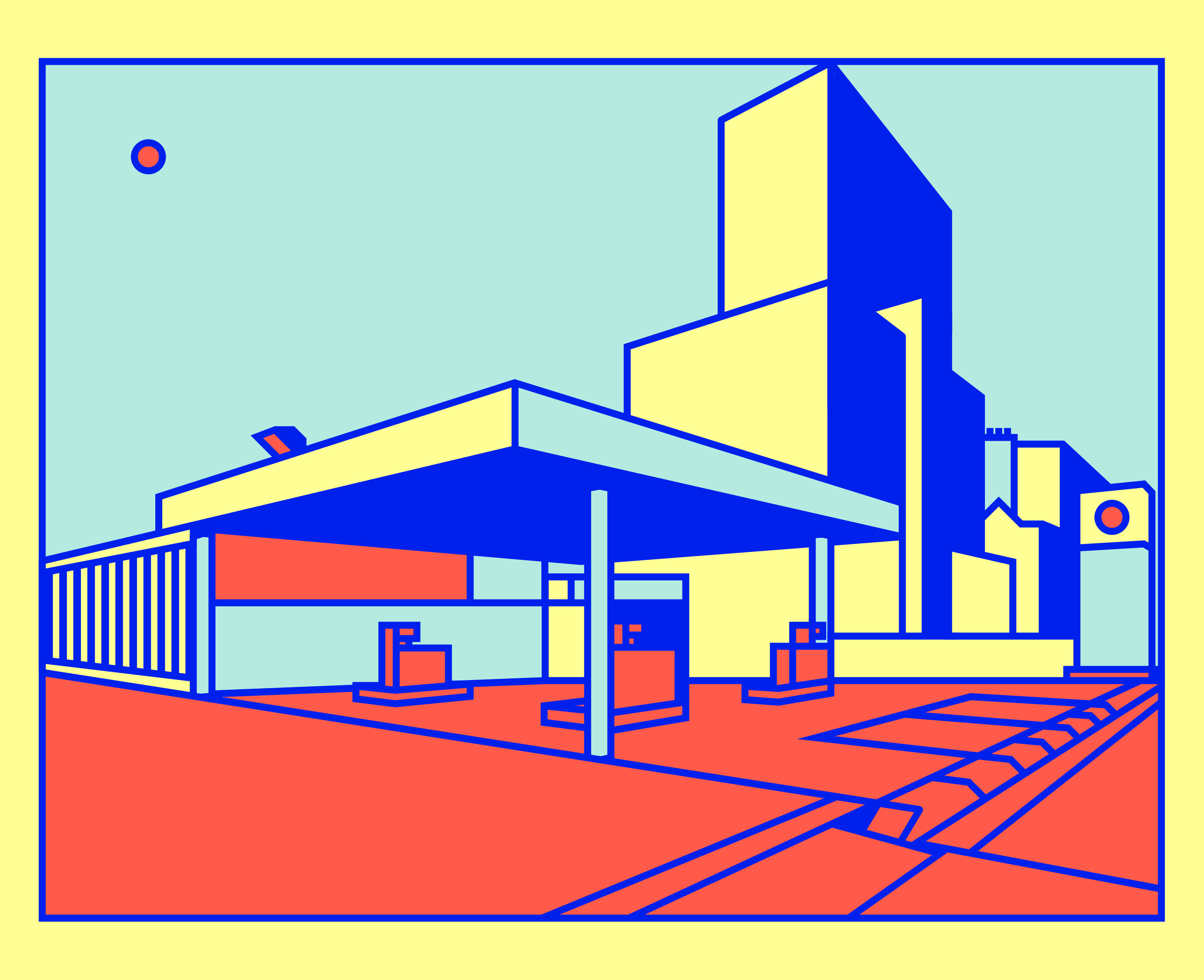
Thomas Hedger has his own unique colour palate sticking to bold colours combined with his use of back lines creates a bold style.his digital illustrations are eye catching and full of great use of perspective and shadow. I found it really easy to generate idea purely through applying his style to ideas I had and was really happy with what I produced.

Image result for Thomas Hedger

Alva Skog

What attracted me to Alva Skog’s style was the uniqueness of her characters and the slightly rough approach she gives in terms on realism which in tern leads to beautiful representations. She also he’s her own unique set of colours make her images really stand out. She has a great ability at capturing the mood of a place which I though was relevant to my project.

Image result for Alva Skog

Charlie Lewis

Charlie Lewis is a relatively new illustrator whom found on Instagram. What attracted me. to his work was the artistic background to his work whack gives his work the elegance of more traditional art forms but with the clean simple and great colours of digital illustration. I also like how he uses multiple medium and sees things in terms of shapes.

Image result for charlie lewis illustration

Salvatore Di Gregorio

During one of my crits it was suggested that I look at different forms of practice other than illustration so that I would widen my knowledge and inspiration. I did some research and found the work of photographer Salvatore Di Gregorio. I really like how he captures everyday objects in new way and allows the differ t colour in his shots to stand out.

Related image

Barry Blitt

I found Barry Blitt through The New Yorker and while I don’t totally love his style his ideas and ability are incredible. The way he can convey simple ideas with a simple concept in combination with a beautiful detailed illustration is what makes his style great. Why’ll his style is over my head his the way he think and comes up with idea is something will try and use as inspiration.

Image result for Barry Blitt

Kawanishi Hide

Kawanishi Hide was an artist I found while visiting the Museum of Modern art Tokyo, in a gallery full of all kinds of art from traditional to modern I though his work really stood out and were timeless. His use of the wood block print method means he has to use simple shapes but that didn’t stop him from creating beautiful levels of detail. He also uses lovely colour that really capture the spirit of locations.

Image result for Kawanishi Hide

Olimpia Zagnoli

Olimpia Zangoli has an expressive style and prioritises colour in her work. She uses bold shapes and colours and creates work with messages and stories. I enjoyed using her work as inspiration as I liked thinking conceptually and bringing patterns and interesting colour into the illustrations.

Image result for Olimpia Zagnoli

Jordan Awan

I was struck by a lot of the stuff that Jordan Awan did with black and white shapes because while he is good at colour I like the boldness of black and white drawings and the way he represents buildings and places. I liked playing around and aim to use his simple but effective style to represent people and places.

Image result for Jordan Awan

Jan Kallwejt

Jan Kallwejt is another of the illustrators I looked at that creates a lot of work that features cities, particularly focusing on views from above with great detail.If there is one thing I will take from there work

Image result for Jan Kallwejt

Seb Agresti

Seb Agresti has a distinct style and with is distinctive use of colour and addition of texture creates unique stand alone images . While his work is largely abstract approach his work does delve in metaphors. I enjoyed using his sense of line to create stories and his work did inspire me to create work.

Image result for Seb Agresti

Byun Young Geun

Byun Young Geun is another illustrator whose work is a lot more outside my comfort zone. I found it difficult comping up with I dead and bounding of his work as he has a very artistic approach which is not my style. Despite this I am able to appreciate the way he uses colours like blue in his work to create sometimes serial but beautiful work.

Image result for Byun Young Geun

R. Kikuo Johnson

R. Kikuo Johnson has a great ability and creating stories and narratives to help convey the message of a news story or article. This level of ideas mixed with a great ability with colour and detail leads to some stunning images.

Image result for R. Kikuo Johnson

Mason London

Mason London is someone I’ve been a massive fan of for a long time now, he has a exceptional attention for detail not just in terms of line etc but with references within his ideas as well. His work is very based in reality but his attention to detail is what steps this up from little stickers in the corner or peopler in windows.

Image result for mason london

Jean Jullien

I really love Jean Julliens unique character style created from hand drawn lines and then filled in with colour. His style is simple but he is so able to effectively convey messages and tell stories. H also has a great ability with humour and his style enables him to convey emotion very easliy. While I don’t want to copy his style completely it was fun drawing people and being able to represent that person or situation so well.

Image result for Jean Jullien

Nicholas Blechman

Nicholas Blechman is the creative director of the New Yorker Magazine and when he’s not directing the worlds top illustrators, he not bad himself. He often uses just pen and paper but also has a lot of excellent work within digital. I feel that because he start with basics there is a real honesty to his work and I really enjoyed the fact that often his drawing don’t have colour and I found this was an nitrating contrast to most illustration work.

Image result for Nicholas Blechman

Dan Woodger

His sense of humour really shines through with Dan Woodger and overall his style is really fun and enjoyable to look at. He has a clear character style as well as a colour palate of soft colours which  you can see in he highly detailed images.

Image result for Dan Woodger

Peter Jubson

Like Thomas Hedger, Peter Jubson loves a black line but unlike Hedger Jubsons style takes this further. The style he uses is simple but he uses black lines effectively with colour to create really graphical illustrations. I found it really fun to use elements of his style as you can apply it to almost anything generating graphical representations. However Peter Jubson also has his own crazy animations sometimes using his square style to create environments for his ideas.

Image result for Peter Judson

Viva and co

What attracted me to the work of Frank Viva was the funkiness of his style, often depicting people in strange places. He has a unique abstract view and this combined with his soft tones of course make his work what it is. He also has attraction to creating his own abstract environment of which his images take place. His work did inspire me but I found it difficult to replicate his style as it does have such a strong root from his imagination.

Image result for Viva and co

Overall I really enjoyed this period of experimentation and just creating work. Looking back it was a lot harder in places that I first thought as each of these creatives are so skilled it would be impossible for me to create many high lever pieces and maybe I’m learning that if this book will have so many images they might not all be so high quality. There were some images that I were really happy with , a lot more for some artists than others, and aim to use most of them in my final outcome

Franz west at the Tate

A lot of advice I was being given in past projects and again with this one was to diversify my research and look at thinks that I would not normally look at, and this is something that I 100% agree with. While the advice was more focused around philosophers and writers I do feel that looking onto photography sculpture and so on givens me different angels and new ideas.

One thing I liked about Franz West’s work was that a lot of the work had a big sense of freedom and creativity. The work he did with sculpture and paint seems like he didn’t take himself to seriously and just created works well as coming up with strangle idea for art instilations.. I think this idea would be useful during the making and doing stage of this project where instead of worrying if ideas work or not just getting on with it and filling paged with ideas just to get everything out and sometimes ideas can be brought back in later. I was also a big fan of the poster he created with a combination of paint and pictures as it was visually appealing yet something I had not seen yet. This style of creating posters is something I really want to learn and use as I’ve also seen other artists combine 2 styles of drawing to add more depth to and image.

Franz West Rrose/ Drama 2001 Telenor Art Collection © Estate Franz West © Archiv Franz West. Photo: Tate (Matt Greenwood)

Franz West Rose (2001) / Matt Greenwood (2019)

IMG_2607

Franz West Rose 

Overall I would say that this trip wasn’t totally successful as it wasn’t totally informative in terms of my projects and it is a challenge to link to my project. Despite this I do intend to try and use his powers as inspiration for images and maybe even the books cover.


Bibliography

Franz West Rose [exhibition], Tate Modern, 2019 / Mat Greenwood, (2019)  [Photograph] Tate webcite

Franz West Rose [exhibition], Tate Modern, 2019

Pauler scher – Serious play

After watching the documentary about Pauler scher on Netflix I did a Little research and discovered that she had an exhibition in Tokyo at the same time that I was over there it was fate…

I had already built up a fascination on with how she used text to paint pictures as she describes it and her overall ability with typography. However I was also exited to see her map in person to really appreciate them.

Even before seeing them I was a massive fan and when I saw them I was able to really appreciate the scale and level of detail. There is some sort of a structure to them all but the slight differences she makes seem to give each map it own character and reflect the places themselves. One thing I learned from the maps was it’s not how accurate they are but how they connect with peoples emotions and whether they ask questions that create impact. This is something that I will try to understand more as I feel this directly links to my project specifically the identity of places and how they are represented. I intend to do a colour study of her work and maybe even do some experiments with paint to add to my project.

DSC_0214.jpg

Pauler Scher (2014)

The graphic design section on the floor below was also an eye opener. I had made a connection between the maps and my project about places but hadn’t realised the significance og how her typography reflects places to. It’s her posters for the public library which really stand out as even thought they are mainly typography they reflect New York like little design had done before. The posters were busy with loads of text at different angles and sizes and because of this it really reflected New York. I really like this idea that simple text can reflex a place and feel that I should try and learn this and put it into practice when I go on to design the cover as well as the pages of the book.

DSC_0223.jpg

Pauler Scher serious play (2019)

I think that this was a really useful trip as it was a great opportunity to see the work of a top designer that had to very different but equally impressive disciplines. Not only is her work to a high standard and really inspiring but but in most cases, and certainly the 2 I’ve hi lighted, there is a clear sense of location in her work with really resonated with my strange places project. One thing that I was disappointed not to see more of was her corporate work but after analysing the work I did see I realised there are so may connections and what was on show was way more informative than any logo for a bank.


Bibliography

Pauler Scher, (2014) Maps [Painting]. Ginza Gllery, Tokyo.

Pauler Scher serious play [exhibition], Ginza Gallery Tokyo, 2019

Trip to Japan

During my the research week I had the opportunity to go to Japan and decided to use it as a chance to enrich my final major project and explore a different culture.

I would say that the trip was really successful as looking back I had the opportunity to visit many different places from galleries to shrines and temples to experience a different way of living form cultural practices to architecture and food.

IMG_6518

(Ewan Turner, 2019)

For me the main sights where very impressive but for me and fro my project what I found interesting were the everyday things, the things that were similar but so different, by this I mean things like the the the trains and advertising. The train system was very similar but there were slight differences from map designs to stations having theme tunes and some trans being double deckers. Another things was that relevant to me was the importance of illustration an cartoon characters in there advertising with most brands generating their own or using one from popular culture i.i Pokemon.

IMG_1974

(Ewan Turner, 2019)

An interesting thing that I noticed was how I was able to make connections to things back home from yellow lines and crossing marks but was able to see the stark contrast between Japans culture and my own, which was very helpful for my project. Things that I particularly enjoyed nothing were the vending machines that they have everywhere in which it seemed you could fine anything in these machines.

DSC_0011.jpg

(Ewan Turner, 2019)

I was ultimately able to gather  primary research from flyers and maps to photographs and fine Japanese artists to use in my research. If I were to have any complains it would be that I didn’t fine that many artists there or fine that many works by Japanese artist of which I could of brought home and used I’m my sketchbook, I think this comes done to planning which will take into account next trip I do for my FMP. I would have also liked to look more at Japanese traditional artistic practices as well.


Bibliography

Ewan Turner, (2019) Temple. [Photograph]

Ewan Turner, (2019) Poster on the subway. [Photograph]

Ewan Turner, (2019) vending machine. [Photograph]