Chip Kidd

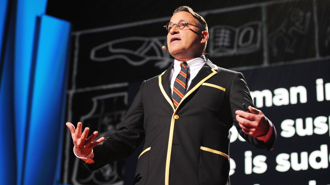
During a on of our making and doing lessons one of our tutors decided to introduce us to the work of Chip Kid and in particular a Ted talk he did about his work. First of all I think this man is a genius as each of his books is so well though out and so much more than just a book cover. One of the first thing he said that really resinated with me was when he said “Don’t show and apple and say an apple’ The ideas bing that you should respect your audience and understand that they can work things out for themselves. Another thing that he talks about of which I think is key is that for books about stories you should show images and for weeks that are more e like conversations you should use text. This is something that have been struggling over for a while and is really helpful as now I can work out what for I want the book to have and then work to use this in designing its cover.

Image result for The hilarious art of book design | Chip Kidd

TED (2012) The hilarious art of book design

Overall I would say this was really helpful as I have been focusing on designers done fro books and not thinking about the actual thinking that goes into previewing a book well and and advertising it correctly. The challenge now is to work out how I want the book to form and then use Kidd’s advice to ensure. I get I right.


Bibliography:

TED (2012) The hilarious art of book design – Chip Kidd. Available at: URL


Franz west at the Tate

A lot of advice I was being given in past projects and again with this one was to diversify my research and look at thinks that I would not normally look at, and this is something that I 100% agree with. While the advice was more focused around philosophers and writers I do feel that looking onto photography sculpture and so on givens me different angels and new ideas.

One thing I liked about Franz West’s work was that a lot of the work had a big sense of freedom and creativity. The work he did with sculpture and paint seems like he didn’t take himself to seriously and just created works well as coming up with strangle idea for art instilations.. I think this idea would be useful during the making and doing stage of this project where instead of worrying if ideas work or not just getting on with it and filling paged with ideas just to get everything out and sometimes ideas can be brought back in later. I was also a big fan of the poster he created with a combination of paint and pictures as it was visually appealing yet something I had not seen yet. This style of creating posters is something I really want to learn and use as I’ve also seen other artists combine 2 styles of drawing to add more depth to and image.

Franz West Rrose/ Drama 2001 Telenor Art Collection © Estate Franz West © Archiv Franz West. Photo: Tate (Matt Greenwood)

Franz West Rose (2001) / Matt Greenwood (2019)

IMG_2607

Franz West Rose 

Overall I would say that this trip wasn’t totally successful as it wasn’t totally informative in terms of my projects and it is a challenge to link to my project. Despite this I do intend to try and use his powers as inspiration for images and maybe even the books cover.


Bibliography

Franz West Rose [exhibition], Tate Modern, 2019 / Mat Greenwood, (2019)  [Photograph] Tate webcite

Franz West Rose [exhibition], Tate Modern, 2019

Pauler scher – Serious play

After watching the documentary about Pauler scher on Netflix I did a Little research and discovered that she had an exhibition in Tokyo at the same time that I was over there it was fate…

I had already built up a fascination on with how she used text to paint pictures as she describes it and her overall ability with typography. However I was also exited to see her map in person to really appreciate them.

Even before seeing them I was a massive fan and when I saw them I was able to really appreciate the scale and level of detail. There is some sort of a structure to them all but the slight differences she makes seem to give each map it own character and reflect the places themselves. One thing I learned from the maps was it’s not how accurate they are but how they connect with peoples emotions and whether they ask questions that create impact. This is something that I will try to understand more as I feel this directly links to my project specifically the identity of places and how they are represented. I intend to do a colour study of her work and maybe even do some experiments with paint to add to my project.

DSC_0214.jpg

Pauler Scher (2014)

The graphic design section on the floor below was also an eye opener. I had made a connection between the maps and my project about places but hadn’t realised the significance og how her typography reflects places to. It’s her posters for the public library which really stand out as even thought they are mainly typography they reflect New York like little design had done before. The posters were busy with loads of text at different angles and sizes and because of this it really reflected New York. I really like this idea that simple text can reflex a place and feel that I should try and learn this and put it into practice when I go on to design the cover as well as the pages of the book.

DSC_0223.jpg

Pauler Scher serious play (2019)

I think that this was a really useful trip as it was a great opportunity to see the work of a top designer that had to very different but equally impressive disciplines. Not only is her work to a high standard and really inspiring but but in most cases, and certainly the 2 I’ve hi lighted, there is a clear sense of location in her work with really resonated with my strange places project. One thing that I was disappointed not to see more of was her corporate work but after analysing the work I did see I realised there are so may connections and what was on show was way more informative than any logo for a bank.


Bibliography

Pauler Scher, (2014) Maps [Painting]. Ginza Gllery, Tokyo.

Pauler Scher serious play [exhibition], Ginza Gallery Tokyo, 2019

Prevent breif

During my research for the prevent strategy brief I was shocked at the direct impact the strategy has had on the educations of many young peoples lives. Simply by being from another background they are being monitored and questioned. This was the inspiration for the idea that I wanted to represent in my final image, the restriction of education.

I decided that the best way to represent this was to have the typical set up of a design in a school with the books etc and to represent the barrio to education the desk was going to be cover in police tap presenting the viewer from being the work.

I am really happy with the image I created as I feel it is very simple yet the message is clear. I am really happy with my idea to use the police tape because this clearly tells such a hard story to tell.

2-e1551794866783.png

Black history month brief

My black history month project was inspired by the use of design during the civil rights movements and more specifically the signs carried on marches. Another massive inspiration was Martin Luther king Jr’s speech ‘ I have a dream’ and the impact it had and will have forever.

March On Washington For Jobs & Freedom

After I had finished my research and my experimentation I decided that that I wanted to creat an illustration of Martin Luther king Jr rather than have it on its own I would have it on a sign once used during the civil rights movement. I felt this was a way to add deeper meaning and a perfect way to frame and image of MLK.

Screen Shot 2018-10-27 at 20.12.20

I was very happy with the way the image turned out and feel that while my research was no extensive enough I have effectually used it to create an image that has clear link. I am especially happy with the idea to frame MLK as I feel it is a good tribute.

mlgbhm

Packaging day 6 – Group crit

My crit went really well and my work was held to high standard which I thick was really important. Something that allowed this to happen was the fact that we were in group of friends which helped us be more honest with people rather than worry about what we said.

The positives were that my sketchbook was very good and there high a high amount of experimentation. It was also noted that I had done a lot of research into paper and material for packaging.

One of the negatives were that my final outcome was good but was not perfectly neat which is part of finding that energy to finches a product to a high standard in the latter stages of which I need to work on. Another criticism was there wasn’t much thought put into the form of the packaging which is something I agree and feel that the shape is quite basic. I just got caught up in the design and if I had more time I would have pushed the form further, and consider different typed of packaging for products.

Packaging day 5

Following on from the experimentation i did yesterday i decided to carry on along this line. While the design of the packaging was nearly done I decided to spend time on developing the materials and the method used in both the small and big packaging i was going to produce.

I spend a while looking for paper in the material library and brought some from home and then used them to make loads of tests. I found this was a key stage I learned that i had to get the balance between a paper that was strong almost like card but was not to thick or textured to pick up ink well enough to have a clear design. This is also when i made the first mockup of the larger packaging as well.

Now that i had different samples in front of me i was now able to clearly see any issue that i just hadn’t spotted. The major thing was i had some text on the top of the design and while on the larger packaging this was easy to read on the smaller packaging it was impossible. There were also come issues worth the logo which i was easily able to fix.

Packaging day 4

I decided to spend this day testing out ideas for my my final brand and packaging. I already new that I wanted my brand to have an illustrated element inside of it that I would change for different products/flavours while also having the text going around it that would stay the same.

Once I had developed the text and finalised the part of the logo that would stay the same I then moved on to developing the illustrations. I painted them using drawing ink in my sketchbook, they were then scanned in and added onto the illustrator file were I was putting everything together.

This was were I realised I had made them too short and that they didn’t go down the whole packet as planned. I then texted this by making a few samples and didn’t like the way they looked do I re did the ink and made them the right length.

During the mid point crib I showed the testing I was doing and this was encouraged. I also got some feedback that because the products and the packs were small maybe I should put them in some bigger packaging which is something I plan to work on tomorrow.

Packaging day 3

Today we had two workshops, Make a box on illustrator with Soof and Fluid Packaging with Olly.

The first workshop was about how to make clipping masks so that we could place images onto a net for packaging, this was useful as it went on to help me create an initial idea I had and carry out tests. Despite this the thing I found most useful was the net template we were given.I found this template  really helpful as it allowed me to have a starting point of a basic packaging net to  start experimenting with ideas.

I also found the packaging workshop we did with Oliver very important. We had to create packaging for plastic balls using only scrap that was lying around. This was another freeing workshop as there were no standards so we were free to just create experiment. This workshop was really effective in its task to help us thing outside the norms of a simple go and has defiantly inspired me to look further.